Happy New Year!
For spring 2026 courses, we introduced a refreshed Perusall interface alongside updates to grouping and assignments. These changes are grounded in a simple goal: supporting learning by reducing friction for instructors and creating more space for students to focus on reading, discussion, and understanding.
Want to see a walkthrough of our new design and features? Join us for Brian Lukoff’s New Features 2026 webinar on January 7th, 2026. Register here for free.
What’s changed: Everything is easier to find
Previously we had a course home and then a secondary menu for things like the Library, Assignments, and Students in addition to the main sidebar. Now, everything lives in the main sidebar to make navigation easier.
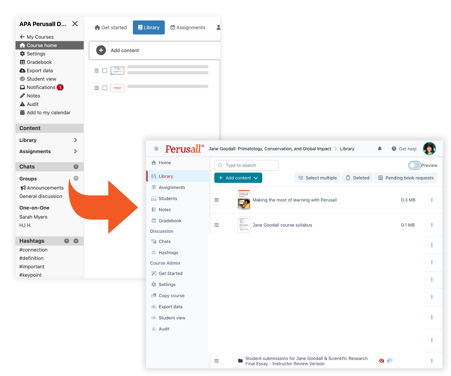
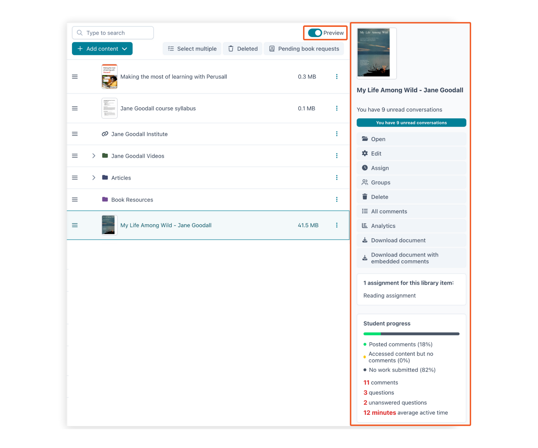
The library: Simpler & more focused
In the Library, you’ll still see the same core behaviors you’re used to (content list, drag-and-drop, and folders) and access to a preview pane so you can quickly see what’s happening with that content: student progress, activity, and the standard actions you might want to take.
But if you prefer a cleaner view, you can turn the preview pane off and access those actions through a simple dropdown menu.
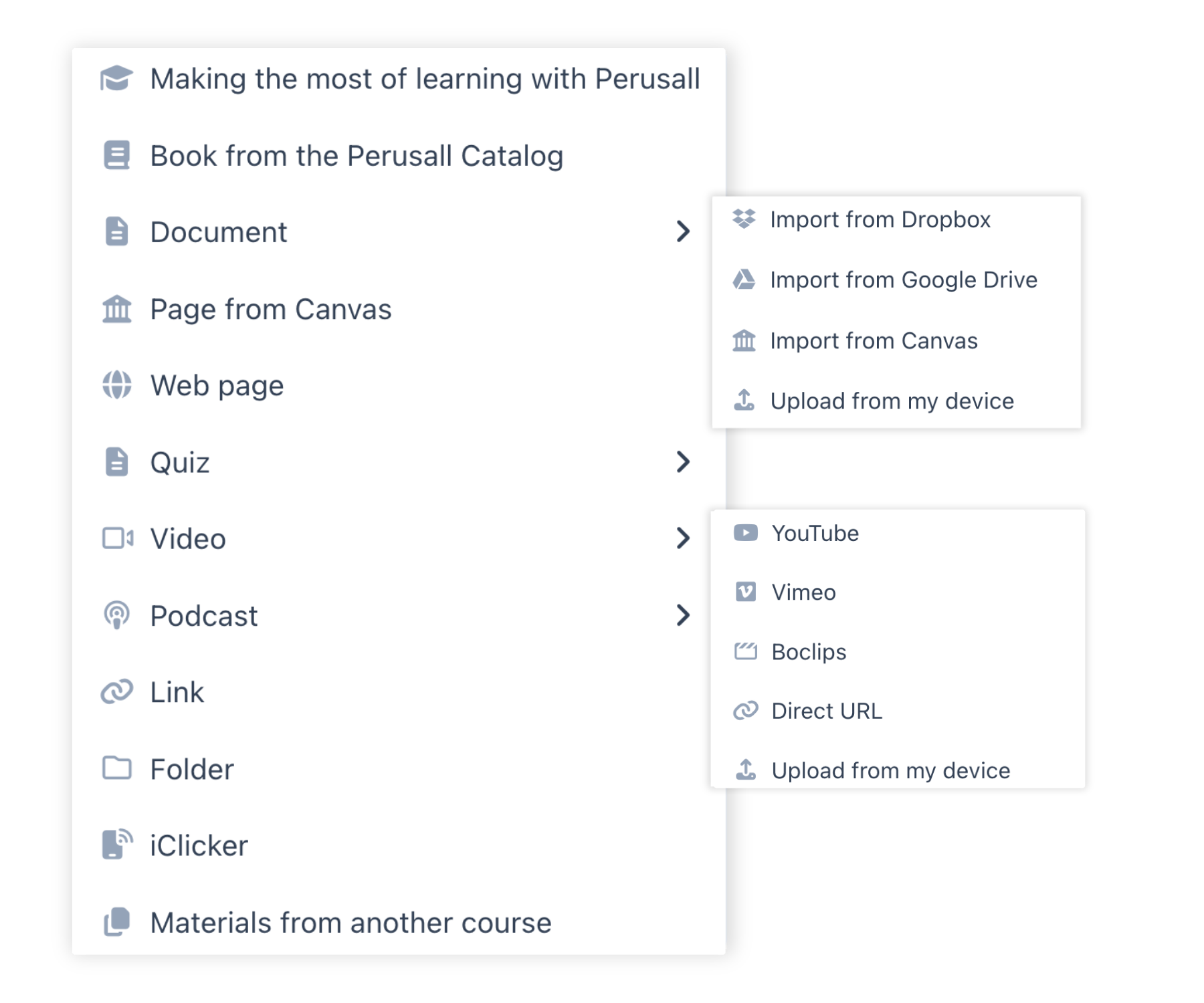
Adding Content: One Place for Everything
If you want to add content to the Library, you’ll notice there’s now a single “Add content” button at the top. This centralizes all the same content options you already have in Perusall today:
- Books from our catalog
- Documents from your device
- Imports from elsewhere
And if your course is connected to an LMS, you may also see options for LMS-based imports and other integrations.
Assignment creation: Fewer tabs, less friction
When you create a standard assignment, you’ll notice we’ve reduced the number of tabs and simplified how you get to key settings.
For example, instead of having a separate “Scoring” tab, you can select your scoring template directly in the assignment creation flow. You can also:
- Edit the scoring template right there
- Create a new scoring template from scratch and apply it immediately
This also applies to rubrics: you can create and manage them more directly within the assignment flow.
.png)
Scoring templates: A cleaner way to customize and weigh components
Scoring templates are also designed to be easier to read and manage. You can adjust weights by category and see a visual representation of the distribution.
If you want to customize any individual setting, you can click into it and change it right there without leaving your workflow.
.png)
Reading view: More space to focus on content
Once you open an assignment, you’ll notice an important change: the sidebar fades away.
A big goal of the UI refresh is to give students more room to focus on the content itself. In practice, students are often launching content directly from the LMS, and we don’t want them to feel like they have to understand the full course structure in order to start engaging.
If students want to, they can close everything and focus entirely on the reading, watching, or listening experience.
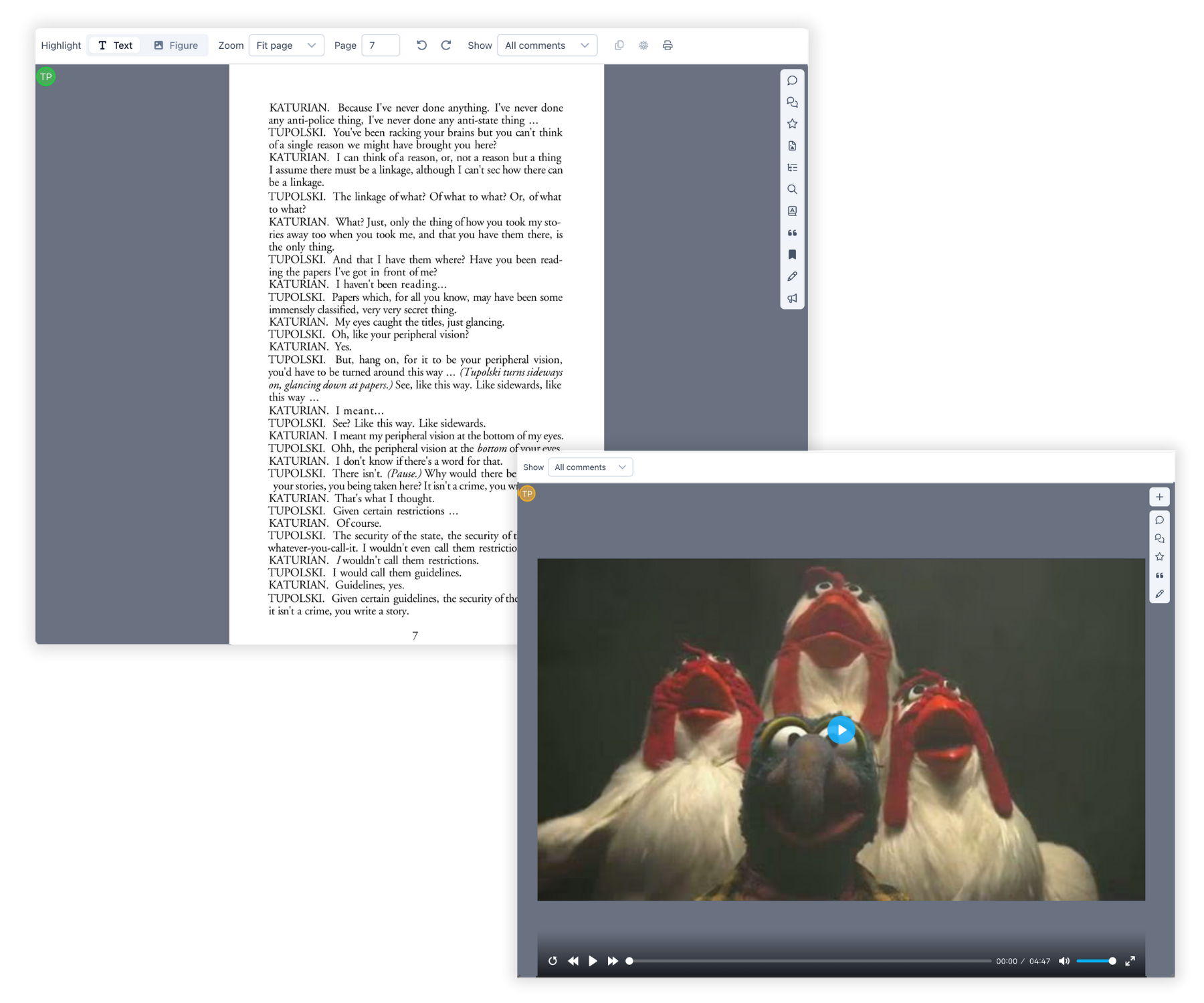
A redesigned toolbar
You’ll also see a redesigned top toolbar that provides students with easier annotating actions like switching between highlighting text, highlighting figures, or dropping pins. Comment filtering has also been consolidated into a single dropdown.

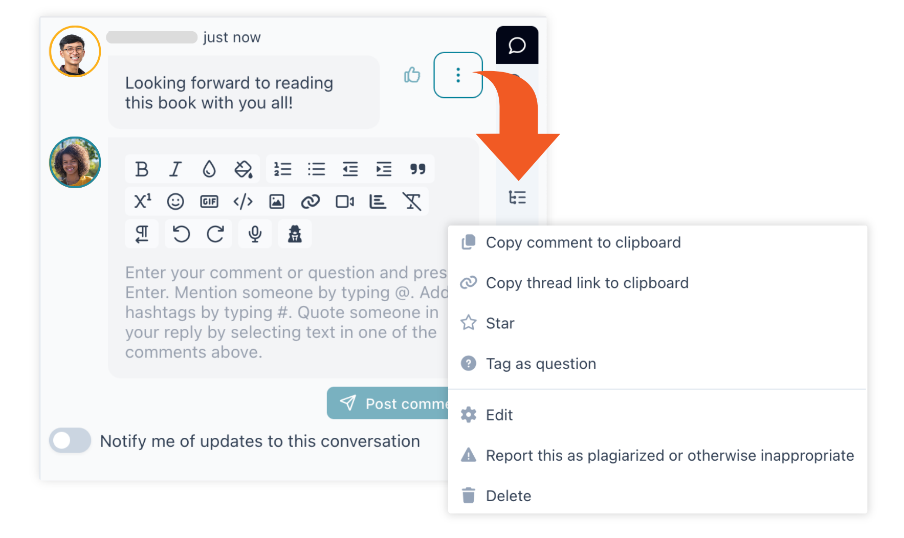
Comment actions: Consolidated and cleaner
Instead of having lots of icons under every comment, we’ve consolidated those actions into a single dropdown menu. That menu gives you access to everything you’d expect:
- Marking a comment as something students must respond to before seeing replies
- Starring
- Tagging as a question
- Editing or deleting
- Viewing (and adjusting) comment scoring, including manual rescoring

The goal is to keep the interface visually cleaner while still keeping functionality easily accessible when you need it. Upvoting is also easy and clearly visible, including when an instructor upvotes a student’s question.
Multi-part assignments: Clearer for students
Multi-part assignments now display in a way that makes it much more obvious to students:
- That they are in a multi-part assignment
- Which part they’re currently working on
- How to move to the next part
This helps reduce the chance that students miss a step unintentionally.
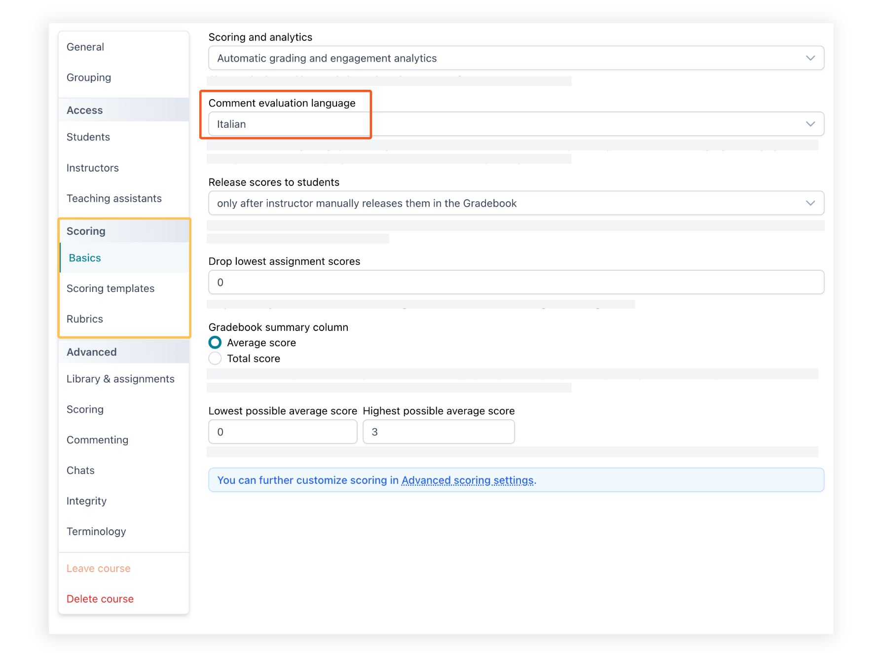
Settings: Reorganized
The scoring-related setup is now consolidated into a dedicated “Scoring” area, including:
- Whether you use automated grading, manual grading, or no grading
- Whether you use analytics
- Comment language selection (which affects the scoring algorithm)
We’ve added Italian as a new language option for automatically scoring comments!
Applying scoring templates (and rubrics) more quickly
Another streamlining improvement: it’s now easier to apply scoring templates across assignments without opening every assignment individually.
From a scoring template’s menu, you can select “Apply to assignments” and choose one or more assignments in one step. We’ve built the same approach for rubrics, so you can apply them across peer review, fishbowl, and instructor review assignments quickly.
%20more%20quickly.png)
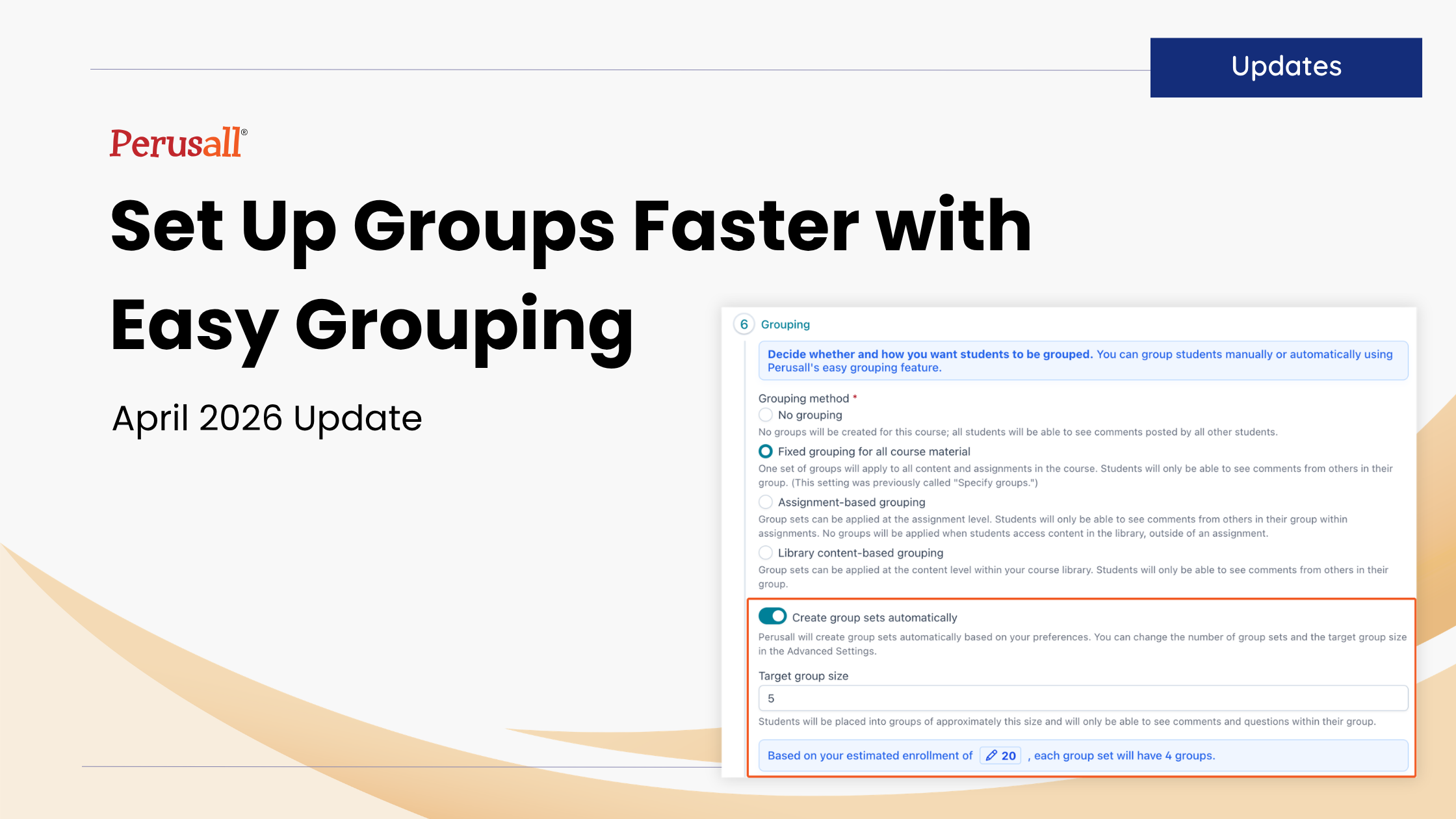
New feature: Rethinking grouping
Historically, Perusall has supported two main approaches:
- Automatic grouping, where Perusall places students into groups (and groups vary by document)
- Manual (specified) grouping, where a single group set applies across all content
These options worked, but they weren’t always flexible. Automatic grouping, in particular, could be complicated to understand and control.
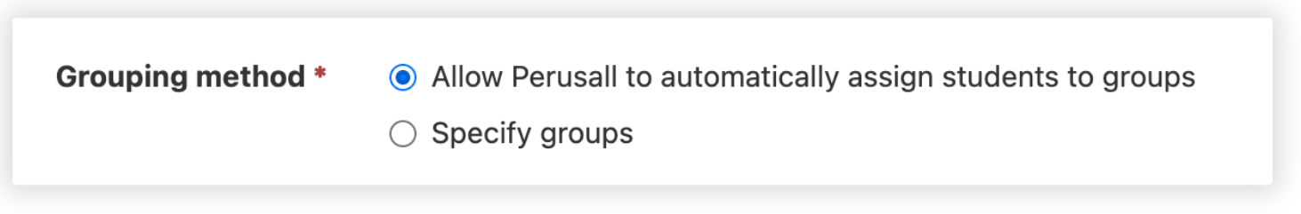
In the refreshed experience, grouping is both more flexible and simpler to set up.
When you set up a course, you’ll have four options for how students are grouped. The first is simple: no groups at all. This is often the right choice for small courses where everyone can work together.
You can also use fixed groups, which is the equivalent of what you might do today with manual groups: one group set that applies across the course.
From there, the big expansion is that you can now apply groups more intentionally:
- Apply different group sets to different assignments
- Apply different group sets to different pieces of content

This makes it much easier to keep track of what’s happening, manage everything in one place, and make grouping choices that match the structure of your course.
If you already have a course set up, you don’t need to worry, we’ll migrate your course into the appropriate grouping setting automatically. This will be based on how your groups are currently configured.
New feature: Gated assignments based on quiz progress
Today, when you create a multi-part assignment in Perusall, students can complete parts in any order. That can be perfectly fine, but sometimes, you want students to move through the assignment in a specific sequence.
This feature supports a pattern we’ve seen work really well: mixing content (readings, videos, podcasts) with Perusall quizzes so students can:
- Engage with content
- Discuss it with classmates
- Check understanding through a quiz before moving on
With gated assignments enabled, students can’t move to the next part of an assignment until they’ve completed all quizzes up to that point.
So if you build a multi-part assignment like:
- Part 1: Content
- Part 2: Quiz
- Part 3: More content
Students won’t be able to move from Part 2 to Part 3 until they complete the quiz in Part 2.
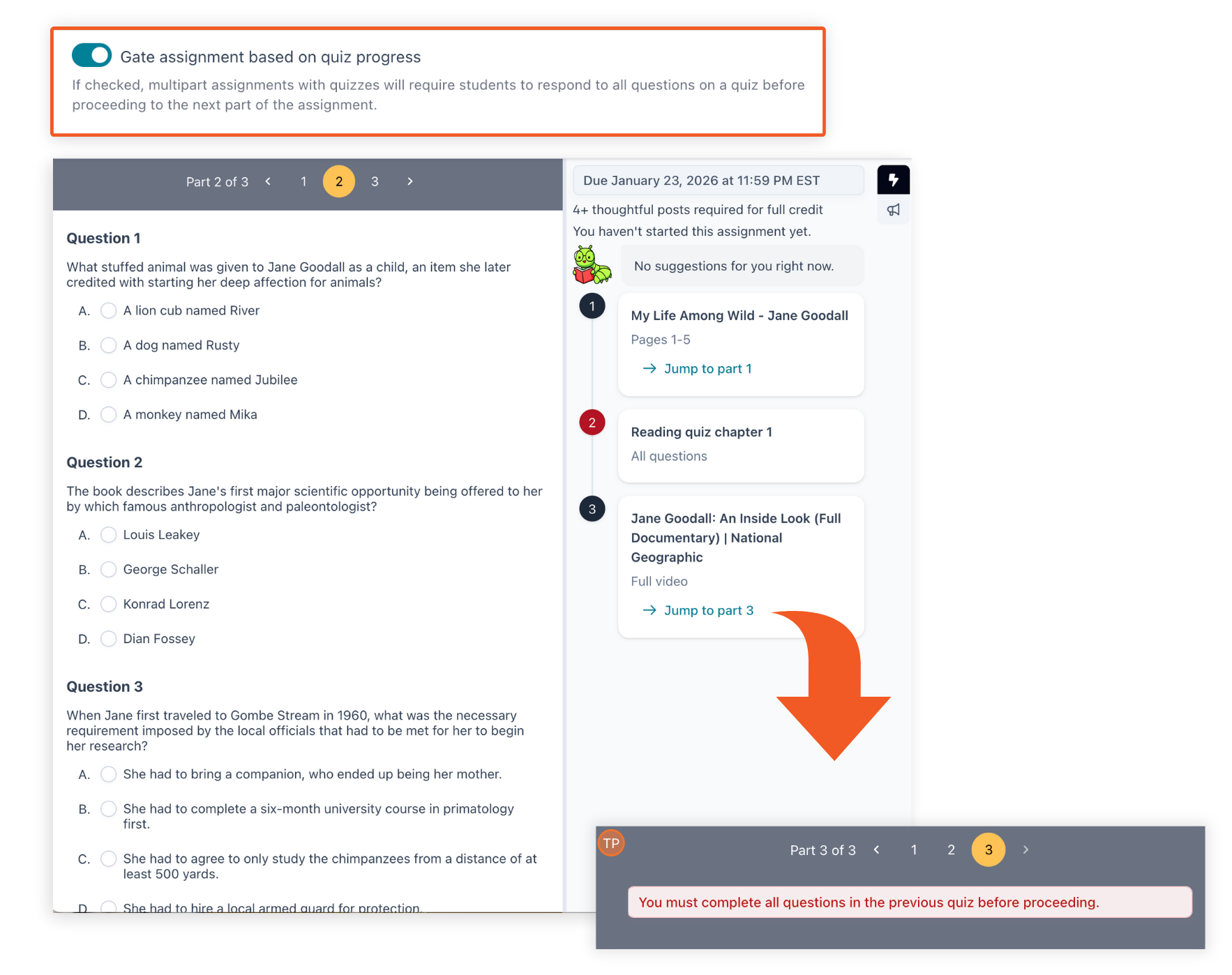
You can also include multiple quizzes throughout, creating a structured rhythm where students read or watch a bit, discuss, answer questions, and continue.
We’ve got a lot of exciting things we’re working on for 2026, and we’re looking forward to sharing them with you.
See a walkthrough of Perusall's new look and features: Join Brian Lukoff’s New Features 2026 webinar on January 7th, 2026.
.png)